Pythonのグラフ描画ライブラリMatplotlibの基礎
Posted: | Tags: Python, Matplotlib
matplotlibは出版できる品質の図を作成できるPythonのグラフ描画ライブラリ。
matplotlib is a python 2D plotting library which produces publication quality figures in a variety of hardcopy formats and interactive environments across platforms. matplotlib: python plotting — Matplotlib documentation
公式のギャラリーにいろいろな例が載っている。
使い方
一つのグラフ
import numpy as np
import matplotlib.pyplot as plt

x = np.linspace(0, 2.0, 20)

plt.plot(x, x, 'b:')
plt.plot(x, x**1.5, 'rs-')
plt.plot(x, x**2, color='#30F050', marker='^', markerfacecolor='blue', markeredgecolor='blue')

plt.tight_layout()

plt.savefig("data/dst/matplotlib_example_single.png")
source: matplotlib_example_single.py
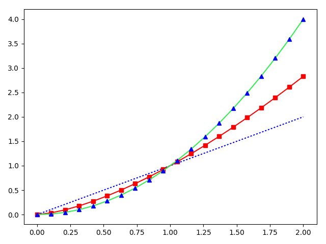
pyplot.plot()で折れ線グラフを作成できる。pyplot.plot()を繰り返すと、ひとつのグラフに複数プロットされる。折れ線グラフの他には、棒グラフpyplot.bar()、散布図pyplot.scatter()などがある。
線、マーカーの種類、色をシンプルな表記で設定できる。例えば、青い点線の場合'b:'、赤い四角のマーカー付き実線の場合'rs-'というように設定する。種類はたくさんあるので公式ドキュメント参照。
色はcolor='#30F050'のようなHex表記やcolor=(0.5, 1, 0)のようなRGB表記(Max=1.0)でも設定可能。線の色colorとマーカーの色markerfacecolorを別々にすることもできる。
複数のグラフ
複数のグラフをまとめて描画することもできる。
import numpy as np
import matplotlib.pyplot as plt

fig, ((ax00, ax01, ax02), (ax10, ax11, ax12)) = plt.subplots(nrows=2, ncols=3, sharey=True)

x = np.arange(4)

ax00.plot(x, x, 'ro--')
ax01.plot(x, x**1.5, 'g^-.')
ax02.plot(x, x**2, 'bs:')
ax10.bar(x, x + 1, width=0.5, align='center', color='r')
ax11.bar(x, x**1.5 + 1, width=0.5, align='center', color='g')
ax12.bar(x, x**2 + 1, width=0.5, align='center', color='b')

plt.rcParams['font.size'] = 10
plt.tight_layout()

plt.savefig("data/dst/matplotlib_example_multi.png")
source: matplotlib_example_multi.py
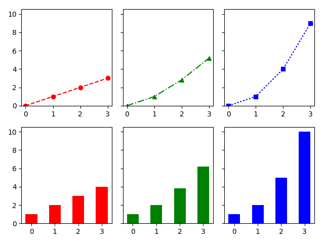
plt.subplots()でfigureオブジェクトと複数のaxesオブジェクトが得られる。axesオブジェクトに対して、一つのグラフと同じように設定していく。