Python, pandas, seabornでヒートマップを作成
Pythonのビジュアライゼーションライブラリseabornを使うと、二次元データを可視化するヒートマップが簡単に作成できる。
seaborn.heatmap()関数を使う。
pandasは必須ではないが、二次元データとしてpandas.DataFrameを用いると行名・列名がそのままx軸・y軸のラベルとして表示されて便利。
ここでは、以下の内容について説明する。
seaborn.heatmap()関数の基本的な使い方- オブジェクトとして操作
seaborn.heatmap()関数の主な引数- 数値を表示: 引数
annot - カラーバー表示・非表示: 引数
cbar - 正方形で表示: 引数
square - 最大値、最小値、中央値を指定: 引数
vmax,vmin,center - 色(カラーマップ)を指定: 引数
cmap - サイズを指定
- 数値を表示: 引数
- 活用例: 多数の特徴量を持つデータの相関係数を可視化
以下のライブラリをimportしておく。
import seaborn as sns
import pandas as pd
import numpy as np
import matplotlib as mpl
import matplotlib.pyplot as plt
Jupyter Notebookでグラフをインラインで表示したい場合は%matplotlib inlineを実行しておく。
seaborn.heatmap()関数の基本的な使い方
seaborn.heatmap()の第一引数dataには可視化したい二次元配列を指定する。
Pythonのリストの二次元配列(リストのリスト)、numpy.ndarray、pandas.DataFrameを指定できる。
Pythonのリストの二次元配列(リストのリスト)の場合。
list_2d = [[0, 1, 2], [3, 4, 5]]
Jupyter Notebookの場合は%matplotlib inlineを実行してからseaborn.heatmap()を実行するとグラフがインラインで表示される。
sns.heatmap(list_2d)
画像ファイルとして保存する場合はplt.savefig()、ファイル保存ではなくOSの画像表示プログラムで表示する場合はplt.show()を使う。
繰り返しグラフを作成する場合はplt.figure()で新たなFigureを生成するかplt.clf()で初期化しておかないと前の描画結果が残ることがあるので注意。Jupyter Notebookでインライン表示する場合は特に初期化の必要はない。
さらに、複数(初期値では20以上)のFigureを生成すると警告が出る。plt.savefig()またはplt.show()のあとでplt.close('all')を実行しておけばOK。
plt.figure()
sns.heatmap(list_2d)
plt.savefig('data/dst/seaborn_heatmap_list.png')
plt.close('all')
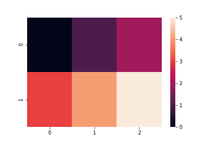
numpy.ndarrayの場合。
arr_2d = np.arange(-8, 8).reshape((4, 4))
print(arr_2d)
# [[-8 -7 -6 -5]
#  [-4 -3 -2 -1]
#  [ 0  1  2  3]
#  [ 4  5  6  7]]

plt.figure()
sns.heatmap(arr_2d)
plt.savefig('data/dst/seaborn_heatmap_ndarray.png')
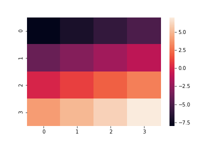
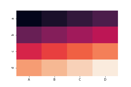
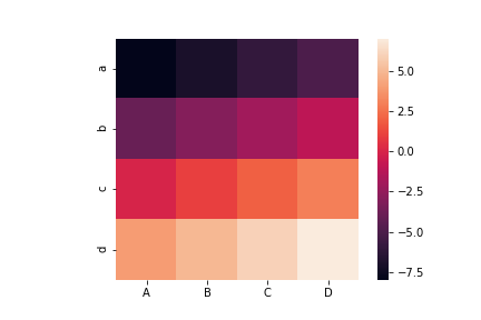
pandas.DataFrameの場合。pandas.DataFrameだと行名index、列名columnsがx軸・y軸のラベルとして表示される。
df = pd.DataFrame(data=arr_2d, index=['a', 'b', 'c', 'd'], columns=['A', 'B', 'C', 'D'])
print(df)
#    A  B  C  D
# a -8 -7 -6 -5
# b -4 -3 -2 -1
# c  0  1  2  3
# d  4  5  6  7

plt.figure()
sns.heatmap(df)
plt.savefig('data/dst/seaborn_heatmap_dataframe.png')

オブジェクトとして操作
seaborn.heatmap()が返すのはMatplotlibのAxesSubplotオブジェクト。
print(type(sns.heatmap(list_2d)))
# <class 'matplotlib.axes._subplots.AxesSubplot'>
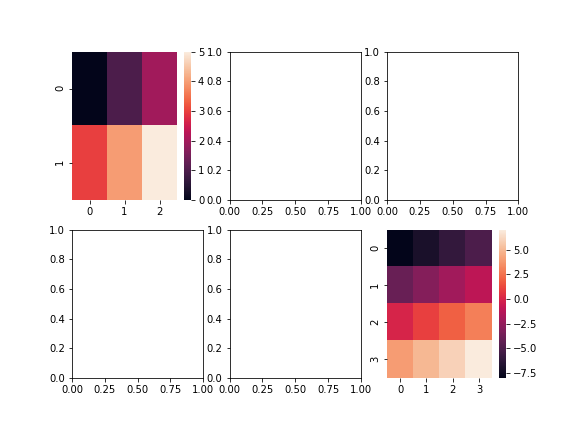
デフォルトではアクティブなサブプロットに描画されるが、seaborn.heatmap()の引数axで任意のサブプロットを指定して描画できる。
fig = plt.figure()
ax = fig.add_subplot(1, 1, 1)
sns.heatmap(list_2d, ax=ax)
fig.savefig('data/dst/seaborn_heatmap_list.png')
fig, axes = plt.subplots(nrows=2, ncols=3, figsize=(8, 6))
sns.heatmap(list_2d, ax=axes[0, 0])
sns.heatmap(arr_2d, ax=axes[1, 2])
fig.savefig('data/dst/seaborn_heatmap_list_sub.png')
seaborn.heatmap()関数の主な引数
seaborn.heatmap()で指定できる主な引数を示す。
ここで挙げるもの以外もある。公式サイトを参照。
数値を表示: 引数annot
ヒートマップ上に数値を表示する場合はannot=Trueとする。
sns.heatmap(df, annot=True)

カラーバー表示・非表示: 引数cbar
カラーバーを非表示にするにはcbar=Falseとする。
sns.heatmap(df, cbar=False)
正方形で表示: 引数square
square=Trueとするとヒートマップが正方形で描画される。
sns.heatmap(df, square=True)
最大値、最小値、中央値を指定: 引数vmax, vmin, center
ヒートマップの最大値、最小値、中央値はそれぞれvmax, vmin, centerで指定する。
sns.heatmap(df, vmax=10, vmin=-10, center=0)
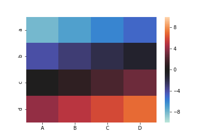
色(カラーマップ)を指定: 引数cmap
色はcmapで指定する。Matplotlibで使えるカラーマップがそのまま使える。
以下のMatplotlibの公式サイトにカラーマップが挙げられている。
sns.heatmap(df, cmap='hot')

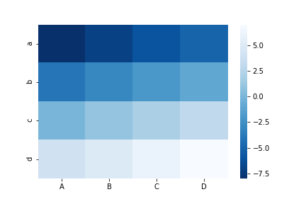
カラーマップの文字列に_rを追加すると色の順番が逆になる。
sns.heatmap(df, cmap='Blues')

sns.heatmap(df, cmap='Blues_r')
サイズを指定
これはseaborn.heatmap()の引数ではないが説明しておく。
生成される画像のサイズはfigsize(単位: インチ)とdpi(インチ当たりのドット数)で決定される。
figsizeはplt.figure()またはplt.subplots()の引数で、dpiはsavefig()の引数で指定する。
それぞれ以下のように確認および変更ができる。
current_figsize = mpl.rcParams['figure.figsize']
print(current_figsize)
# [6.0, 4.0]

plt.figure(figsize=(9, 6))
sns.heatmap(df, square=True)
plt.savefig('data/dst/seaborn_heatmap_big.png')

current_dpi = mpl.rcParams['figure.dpi']
print(current_dpi)
# 72.0

plt.figure()
sns.heatmap(df, square=True)
plt.savefig('data/dst/seaborn_heatmap_big_2.png', dpi=current_dpi * 1.5)

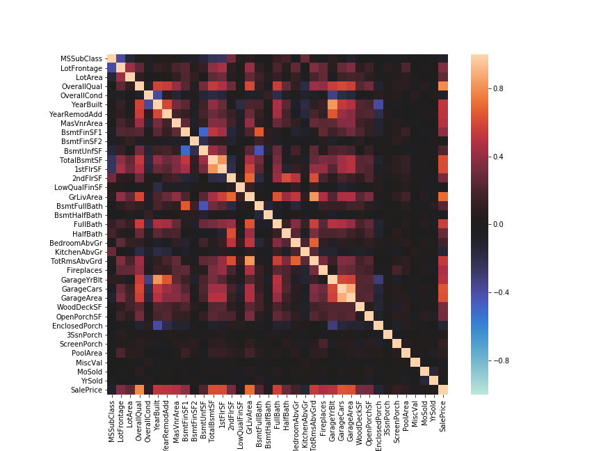
活用例: 多数の特徴量を持つデータの相関係数を可視化
具体的な活用例として、多数の特徴量を持つデータの相関係数を可視化する。
Kaggleの住宅価格を推定する問題のトレーニングデータを使用する。
こちらにも置いてある。
pandas.DataFrameのメソッドcorr()を使うと、pandas.DataFrameの各列の間の相関係数を算出できる。
df_house = pd.read_csv('data/src/house_prices_train.csv', index_col=0)

df_house_corr = df_house.corr()
print(df_house_corr.shape)
# (37, 37)

print(df_house_corr.head())
#              MSSubClass  LotFrontage   LotArea  OverallQual  OverallCond  \
# MSSubClass     1.000000    -0.386347 -0.139781     0.032628    -0.059316
# LotFrontage   -0.386347     1.000000  0.426095     0.251646    -0.059213
# LotArea       -0.139781     0.426095  1.000000     0.105806    -0.005636
# OverallQual    0.032628     0.251646  0.105806     1.000000    -0.091932
# OverallCond   -0.059316    -0.059213 -0.005636    -0.091932     1.000000
#              YearBuilt  YearRemodAdd  MasVnrArea  BsmtFinSF1  BsmtFinSF2  \
# MSSubClass    0.027850      0.040581    0.022936   -0.069836   -0.065649
# LotFrontage   0.123349      0.088866    0.193458    0.233633    0.049900
# LotArea       0.014228      0.013788    0.104160    0.214103    0.111170
# OverallQual   0.572323      0.550684    0.411876    0.239666   -0.059119
# OverallCond  -0.375983      0.073741   -0.128101   -0.046231    0.040229
#                ...      WoodDeckSF  OpenPorchSF  EnclosedPorch  3SsnPorch  \
# MSSubClass     ...       -0.012579    -0.006100      -0.012037  -0.043825
# LotFrontage    ...        0.088521     0.151972       0.010700   0.070029
# LotArea        ...        0.171698     0.084774      -0.018340   0.020423
# OverallQual    ...        0.238923     0.308819      -0.113937   0.030371
# OverallCond    ...       -0.003334    -0.032589       0.070356   0.025504
#              ScreenPorch  PoolArea   MiscVal    MoSold    YrSold  SalePrice
# MSSubClass     -0.026030  0.008283 -0.007683 -0.013585 -0.021407  -0.084284
# LotFrontage     0.041383  0.206167  0.003368  0.011200  0.007450   0.351799
# LotArea         0.043160  0.077672  0.038068  0.001205 -0.014261   0.263843
# OverallQual     0.064886  0.065166 -0.031406  0.070815 -0.027347   0.790982
# OverallCond     0.054811 -0.001985  0.068777 -0.003511  0.043950  -0.077856
# [5 rows x 37 columns]
pandas.corr()は数値の列のみが対象で、欠損値NaNは除外して算出される。
本来はNaNの補完や文字列のカテゴリー変数の数値化などの必要があり、データをそのまま読み込んで使うのは乱暴ではあるが、各変数の関係性をとりあえずざっくり確認するのに非常に便利。
なお、この例のように変数が多い場合はサイズを大きくしておかないと結果が見にくいので注意。
fig, ax = plt.subplots(figsize=(12, 9))
sns.heatmap(df_house_corr, square=True, vmax=1, vmin=-1, center=0)
plt.savefig('data/dst/seaborn_heatmap_house_price.png')