Matplotlibで画像のヒストグラムを可視化
matplotlibを使った実践的な例として、画像のヒストグラムを可視化してみる。使う画像はお馴染みのlena。

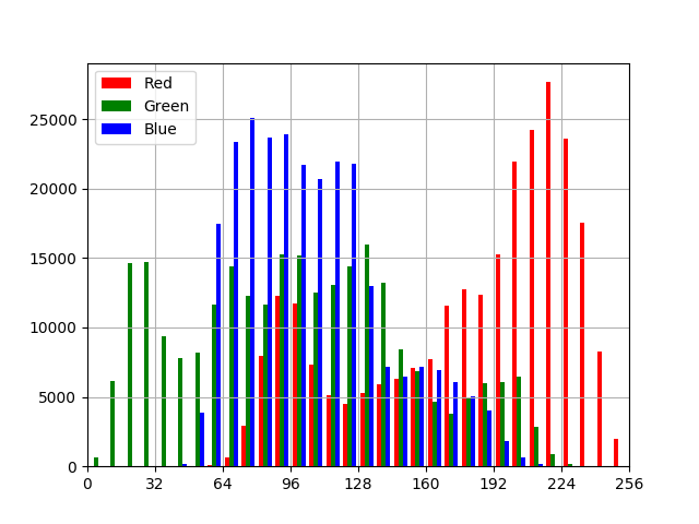
一つのグラフ
from PIL import Image
import numpy as np
import matplotlib.pyplot as plt

im = Image.open('data/src/lena_square.png')

r = np.array(im)[:, :, 0].flatten()
g = np.array(im)[:, :, 1].flatten()
b = np.array(im)[:, :, 2].flatten()

bins_range = range(0, 257, 8)
xtics_range = range(0, 257, 32)

plt.hist((r, g, b), bins=bins_range,
         color=['r', 'g', 'b'], label=['Red', 'Green', 'Blue'])
plt.legend(loc=2)

plt.grid(True)

[xmin, xmax, ymin, ymax] = plt.axis()
plt.axis([0, 256, 0, ymax])
plt.xticks(xtics_range)

plt.savefig("data/dst/matplotlib_histogram_single.png")
source: matplotlib_histogram_simple.py
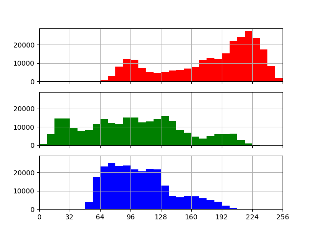
複数のグラフ
from PIL import Image
import numpy as np
import matplotlib.pyplot as plt

im = Image.open('data/src/lena_square.png')

r = np.array(im)[:, :, 0].flatten()
g = np.array(im)[:, :, 1].flatten()
b = np.array(im)[:, :, 2].flatten()

bins_range = range(0, 257, 8)
xtics_range = range(0, 257, 32)

fig, (ax0, ax1, ax2) = plt.subplots(nrows=3, ncols=1, sharex=True, sharey=True)

ax0.hist(r, bins=bins_range, color='r')
ax1.hist(g, bins=bins_range, color='g')
ax2.hist(b, bins=bins_range, color='b')

plt.setp((ax0, ax1, ax2), xticks=xtics_range, xlim=(0, 256))
ax0.grid(True)
ax1.grid(True)
ax2.grid(True)

plt.savefig("data/dst/matplotlib_histogram_multi.png")
source: matplotlib_histogram_multi.py